Braid in my hair by Day for Daisies for Spring

I first saw the stamps by A Day For Daisies being used by the wonderful Coops– I always love her cards and I fell in love with the stamps. This stamp is called Braid In My Hair and I thought it was perfect for a floral Spring birthday card.

Braidinmyhairdayfordaisies1

The image was coloured with Letraset Promarkersand FlexMarkers and I used Sakura Souffle Pens on the birds to give some contrast to her hair. The flowers are all from Wild Orchid Crafts. The yellow paper is from the first edition paper pad- hideaway
and is layered onto black card from my stash. I used a flower petal punch with Papermania Parkstone Paper to create the sentiment flower and the sentiment is from Lili of the Valley.

Braidinmyhairdayfordaisies2I would like to enter the following challenges

Sentimental Sundays- Springtime flowers

Come and Get It Challenge- One for the girls

Make My Monday challenge blog- flowers

Deep ocean challenge- Easter/ Spring

The Shabby Tea Room- Beautiful Blooms

Sketch and color challenge number 10

40th birthday card

This card was comissioned for a 40th birthday. The recipient likes Cath Kidson so I went for floral, shabby chic in spring cottage garden colours!

A one of a kind card made for a 40th birthday.

I used a beautiful digital stamp called flower maiden 2 by A Day For Daisies . I coloured her with Promarkers and FlexMarkers and I diligently kept a list of colours I used and put it somewhere safe! (if it ever surfaces I’ll post them!!)

I used Papermania Eau De Nil Jumbo Crochet Trim to make the ribbon and topped it with a gemstone cluster.

The papers are from the beautiful Santoro Mirabelle Paper Pad and are layered onto pastel pink card which was then stickled.

I added a trio of gems to top right and bottom left of the image.

Iona2

I decorated the inside of the card to match.

40th birthday card

Finally I cut this envelope on my cougar using a free svg from Bird and tied it with ivory ribbon.

Envelope

I would like to enter my card for the following challenges

Scrap & Craft inspiration- challenge 5 Flowers

Cute Card Thursday- challenge 365 Spring Fever

Polkadoodles challenge – Birthdays

Graph-it colouring challenge- Spring colours

Fairytale challenge- Flower Power

Crafts 4 Eternity Recipe Challenge- Pastel Colours


16th birthday memory frame

16th birthday memory frame

Hi!
I can’t believe the backlog of projects I’ve got to blog. You may have noticed I’ve been busy moving and redesigning my blog. I should be back to regular posting soon.
TodayI’m sharing a comissioned project for a 16th birthday gift. I was asked to make a one of a kind memory frame with blue in the colour scheme and for several reasons I decided an astronomical theme was appropriate.
I took the photos in a bit of a rush and they aren’t brilliant as it is difficult to photograph due to the glass.
16th memory frame 1

I decided to use some cork in the layers.

16th memory frame 2

I thought for a teenage boy it would be fun to use some wood stars with red beer bottle tops to add some colour.

16th memory frame 3

I thought I could get away with a bit of bling to give a starry effect.

16th memory frame 4

I cropped and resized the photos digitally and placed them to show the progression through the years.

16th memory frame 5

The current photo was taken by his brother and I digitally merged it with some paper and overlaid the lyrics from my wish for you.

16th memory frame 6

I made up the stars using layers of paper and a touch of bling to draw attention.

16th memory frame 7

I couldn’t resist using the little kraft photo corners.

16th memory frame 8

This is my first memory frame for a teenage boy so fingers crossed that he likes it and that he has a great birthday!

I’d like to enter my layout to the following challenges

Not Just Cards challenge 15

Craft My Life- all crafts challenge

Bimini Moose Scrapbook Challenges- Always anything goes

Scrapper’s Delights- Always anything goes

Scrapbooker PhD- challenge 21 bling

Crafting with Attitude- anything goes


An odd discovery!

An odd discovery!

Hi!
The other day as I walked up the garden I spied lots of wood shavings of the lawn. This was very odd and confusing! I looked up into the tree and realised that quite high up their was a perfect circular hole- it looked like it had been done with a tool. The only possible explanation was a woodpecker but it was hard to believe. I sat down with some binoculars and sure enough a woodpecker was happily drilling out a hole in the tree. Hubby set up his camera inside the house and managed to get some photos. I couldn’t resist using one to make a  card for my dad’s birthday.

I designed my papers in Craft Artist using the Autumn colour pallette from the Craft Room challenge blog

and the layout from Sketch Saturday Challenge

Here is the finished card with matching inside

The edges of the card were inked with peeled paint distress ink and the papers edged with marsh green promarker. The gems and button were from stash.
I would also like to enter the Things With Wings challenge at Sparkles monthly challenge.

Lili of the Valley Action boy

Lili of the Valley Action boy

I needed to make this card fairly quickly so I decided to use one of my Lili of the Valley toppers. The colours for the C.R.A.F.T. challenge were perfect to use so I made my papers using Craft Artist and colour matching to this pallette.

I used Kraft card and the various papers and then added 3 stars and the sentiment I made in Craft Artist on foam pads to make it pop a little.

The layout is from the Sketch Wednesday challenge.

I wanted to make the inside match

Just a quick post for a quick card!!

Wee dreamy dragon recuperates

Wee dreamy dragon recuperates

This is a get well card for a friend recuperating from an operation. I was inspired by this photo and colour scheme from the Fun with Shapes and More challenges.

The colours were perfect for the little wee dragon and I loved the photo so much I wanted to use the elements to make some papers in Craft Artist.

I used the colour matching on the software to get the right colours for the papers. I added a starfish motif to the background paper and coloured it orange. I then used a waves and chevron paper recoloured to match the challenge pallette. I layered onto shimmery mango card from my stash and coloured all the edges and sponged the edges of the card with Spiced Marmalade Distress ink.

I added sweetheart bloom flowers from Wild Orchid Crafts and flower gems from stash.
The Dreamy Dragon image is from Wee Stamps and I coloured it with Promarkers. I added a touch of glitter to the middle of the flowers using my Sakura Glitter Pen. I painted the sky using alcohol blending solution to get a sky effect and then painted colouds using my new Molotow white acrylic pen.

I also made the inside. Using Craft Artist meant I could save ink and money by digitally layering the inside.

I would like to enter the following challenges
Digi sketch challenge– Get Well Soon with layout sketch

Fun with shapes and more– colour challenge (inspiration photos and colours at top of post!)
Papertake weekly– Oh how cute
Live and Love Crafts inspiration– things with wings
Natalie and Amy’s Challenge– things with wings

Using a scrapbook layout to make a picture.

Using a scrapbook layout to make a picture.

Something a bit different from me today. My brother recently married and I wanted to make a scrapbook photoframe with a couple of the photos for our house. I’ve blurred several items for privacy reasons.
Since I don’t do much scrapbooking I thought I’d find a challenge layout to help. This one from Stick It Down was perfect as it had a couple of photos on it and the DT layouts sparked off lots of ideas.

This is what I came up with. The title and subtitle are the names of the married couple and the wedding date. Additional embellishments include a couple of our mementos of the day- the heart from the table setting and the wine glass charms we had with our names on them.
The initial photos are taken without the frame- I edged the backing board and edge of the paper with white Acrylic Paint using my fingers. The backing board looks a bit dodgy but there was no point adding another coat as you can’t see it with the frame on.

The 4 main images and papers were made using Craft Artist 2. The backing paper is a scan of the decopage paper my SIL had used for wedding decor.

The papers I used  for the rest of the layout are Hobbycraft Love Collection. I used Barn Door Distress ink on the edges of all my layers. I used red and white Molotow acrylic paint marker pens for my fake stitching + and to write the title and subtitle. I have just bought these and I LOVE them. I am sick and tired of buying pens to use for white writing that are so useless I can’t use them and they end up in the bin. A complete waste of money! The only ones I have that are ok are my Sakura ones but they don’t give me a solid enough effect for many projects. These Molotow ones are amazing- write really well, beautiful for drawing and work on pretty much anything so great for my mixed media work. Sorry I’m gushing but it has been tough doing chalkboard effects without a decent white pen for it!

The large jewel accents were from Hobbycraft but I can’t find a link. I used foam pads on lots of the elements to give some variations in height. One of the papers had this perfect element to use. I used my Sakura Metallic and Stardust pens to go over several elements on the papers to make them pop more….like the frame for this element.

I took a 12 by 12 deep box wood frame and painted it with white acrylic paint (I know….should have just bought a white one!!). I then sponged various shades of teal (using Desert Turquoise and Bahama Blue) on it (some with texture paste added). I then sanded back to give a distressed look.

Not bad considering I don’t tend to scrap much!

I was inspired by the following challenges which I would like to enter
Stick It Down- scrapbook layout challenge.
Divas by Design- anything but a card
Through The Craft Door- anything goes

A bright pattern watercolour card

A bright pattern watercolour card

Hi!
Another attempt at a watercolour card today. I felt like trying something a bit different so I decided to use a Faber-Castell Pitt permanent Pen to build up a pattern based on circles and flowers. I then used my ZIG waterolours to paint it.

I wanted to make all the papers so I echoed my main design and used my Sakura Stardust Gelpen to make them. I coloured the edge of my scalloped card with an Aubergine ProMarker.

I cut a purple and yellow ribbon for the central band. I didn’t have any buttons in my stash that were a good match for the card and since I wanted it to be as handmade as I could I decided to make the buttons. I had previously made a mould of an old button using Siligum. I used Martha Stewart paper clay (red, yellow and white to get orange)  and pressed it into the mould. When it was dry I rubbed some Gold Gilding Wax over the top to bring out the details.

This is a very different style of card for me and I’m not really sure about it!

I would like to enter the following chllenges:-
I followed this sketch from Sketch and Stash Challenge

The colours I used were from the Love to Create colour challenge

A Random Fan challenge- bright colours
Stamp and Create challenge- circles and dots
Crafting for the Craic- something with circles
A Creative Need challenge- textures and/or patterns.

Summary of my bright project 333 summer capsule wardrobe

Summary of my bright project 333 summer capsule wardrobe

Time for the big project 333 reveal!

In reality the time it has taken me to sew and then blog about the projects means I am actually packing away this Summer 333 capsule and getting out my autumn capsule at the moment.

Project 333 is all about dressing with less and on her blog Courtney Carver outlines the rules and gives lots of ideas on approaching it. She also runs a course to help people follow this project to simplify life. The thing I love about her approach is that although there are suggestions on try it is very much up to the individual to adapt the project to fit them. I don’t follow the strictest regime and it has altered over time!

Initially, when I started last year, I followed Courtney’s advice to clear out all the clothes I didn’t choose for my capsule into my storage areas (where I keep off season clothes). When I started I was actually doing project 663  as I would have 33 items of clothing for work and 33 casual for 3 months. The fact that I still had clothes in my storage areas shows that I have too many clothes! My quest was to simplify my wardrobe with the aim of gradually whittling down to having only well made items I love in my wardrobe. However, I want to do this over years. Although I want to cut down on my clothes where possible I want to reuse or recycle items so I want to think carefully about it. I am now doing project 333 to cover both work and casual but don’t necessarily include accessories or shoes in the 33 (in reality I rarely wear accessories and tend to stick to 2 pairs of shoes during a season).

At the end of each 3 months I assess the clothes I have worn and those I am choosing for the next season to decide if it is time to let items go. Over my first year I have found that I usually prefer to use non-traditional neutrals- I’m not big on wearing lots of black, brown, grey, white or beige! On me they tend to be a bit meh! They obviously have their uses so I haven’t necessarily thrown them out. However, I have found that I tend to be choosing my own non-traditional neutrals as I put together my capsule. While doing Project 333 I have become more confident in the colours I like to wear and want to wear- most of the items I’ve recycled or repurposed have been those in colours that don’t really do a lot for me. Where I loved the material and cut  of an item I’ve dyed it a colour that suits me better. I have also sorted out any clothes which I feel are aspirational and don’t suit my current lifestyle. Where possible I am restyling these to fit my requirements so I actually wear them.

When I look in my storage areas now I have a restricted pallette of colours but all ones I like to wear (the same for my fabric stash for sewing). Just before the next season starts I have a quick look at colour trends online and in shops. I usually find a few trends which fit in with colours I have and these are usually the colours I tend to use for my capsule. My Summer capsule is unusual since most of it can be casual wear so I decided to minimise my neutrals. When it is not Summer I will usually have a more traditional neutral in my wardrobe. I generally pull out all the clothes suitable for the season in my proposed colours onto my clothes rack. I then try and choose about 40 items- a mixture of plains and prints in these colours. After a couple of days I re-examine and whittle down to 33, making sure they can mix and match as much as possible. I also put together a list of any items I think need replacing or that I know I haven’t worn so much. I plan to sew or refashion these items. As I make the new items I replace the old ones during the project so by the end of the 3 months I should find I am happily wearing all 33 items.

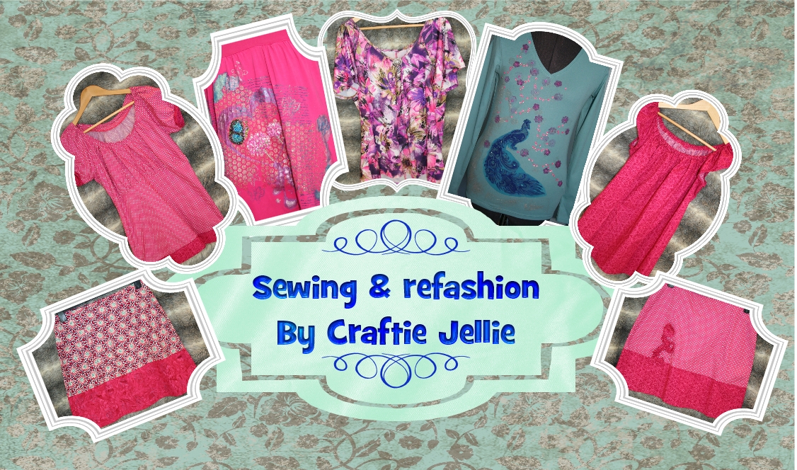
For my summer wardrobe I decided to use mainly pink and purple with some aqua and berry plus the odd neutral item. When I made my selection I realised that I really needed more shorts- initially I used a beige pair while I made two new pairs. I wanted some more patterned tops and I also really needed summer skirts (a lot of these were replacing tops and skirts that were getting very worn, some because they were second had when I got them). I made a list and made the new items.

Once I had finished my sewing my Summer capsule was as follows

Of these tops 7 were ones I had bought new and 4 had been bought in charity shops (all bought before the project). 3 were sewn by me (pink and berry tunic, pink and berry gypsy top and knit purple and pink top).

Of these skirts 2 were bought new, 1 from a charity shop and 5 were made (Pink & berry with flower embellishment, pink wiggle skirt, purple flower knit, reversible pink satin/ purple and multicolour flower).

Of these 7 were bought new and 2 pairs of shorts made (Pink and berry shorts and berry shorts).

This is the first Project 333 I have done where I hadn’t filled up gaps by buying new clothes and sewed them instead. Hopefully these will last well! There is only one of these items that still needs to be replaced- the purple t-shirt from the charity shop (£1) isn’t in very good condition. I do have some purple knit fabric so I should be able to sew a replacement.

Anyone else trying project 333? Have you tried moving away from traditional neutrals?

Sewing the last item for my project 333 summer capsule wardrobe

Sewing the last item for my project 333 summer capsule wardrobe


This is my last make for my Project 333 summer capsule wardrobe. Tomorrow you’ll get to see all 33 pieces.

I used the pattern from my Sew Serendipity book. I love this book- the great way of mixing fabrics and I adore the finishing touches to the garments. I made the same version skirt as last time. I’ve shown it here with the purple vest top I’ll be using in my capsule.

I decided that I wanted to tie in the fabrics a bit more. On the last skirt I did this based on the embellishments described in the book plus one of my own design. This time I wanted to pull some of the pattern from the top of the skirt into the bottom section. I found a swirl stamp that had been free with the June 2012 issue of craft stamper magazine that made a good match for the swirl in the middle of the flower pattern. It was a grungy swirl by artistic stamper.
I have several methods of stamping on fabrics. I usually make a colour swatch of the various inks I have. This time the colour Celadon in my Versacraft ink pads gave me the best match to the aqua colour swirl in my flower fabric. I then stamped my pattern around the bottom section of my skirt using my bar stamping gear. I made my skirt first and marked the centre front and back at the bottom with a water-soluble pen. I then used the bar to stamp the swirl at set intervals. The pictures also show the top stitching. I do feel this makes it seem a bit more professional. What do you think?

Very difficult to get the swirl to show up in photos!

That is my last make for my summer project 333 capsule wardrobe. Tomorrow you’ll get to see all the project 333 items (just as I put them away and get out my Autumn project 333 capsule!!)
Here are the links for all the posts in the series so far

Other posts in my sewing for summer project 333 capsule wardrobe series